Triptych Poster
A triptych poster series is three posters that tell a single story or share a common theme. They work together visually and conceptually to captivate viewers and convey a unified message. This engages the audience by drawing them into the narrative across the series, encouraging them to explore and appreciate the complete set of posters.
How it started
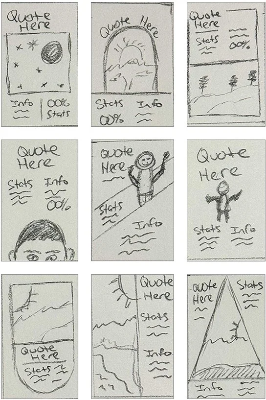
The concept behind this poster series was to create a design for change. Suicide prevention is what I decided to focus the campaign on because I had a loved one take his own life and its truly life changing and is something that I must deal with still today. We’re humans and we aren’t happy all the time, everybody has times when they are down and could use some help. The Suicide & Crisis Lifeline has a lot of resources, information and support, in my opinion they were the perfect choice for this project and I started working off of that ideation. The first sketches featured designs that were all different, that I planned on trying to create a cohesive set with matching colors and imagery.
Colors
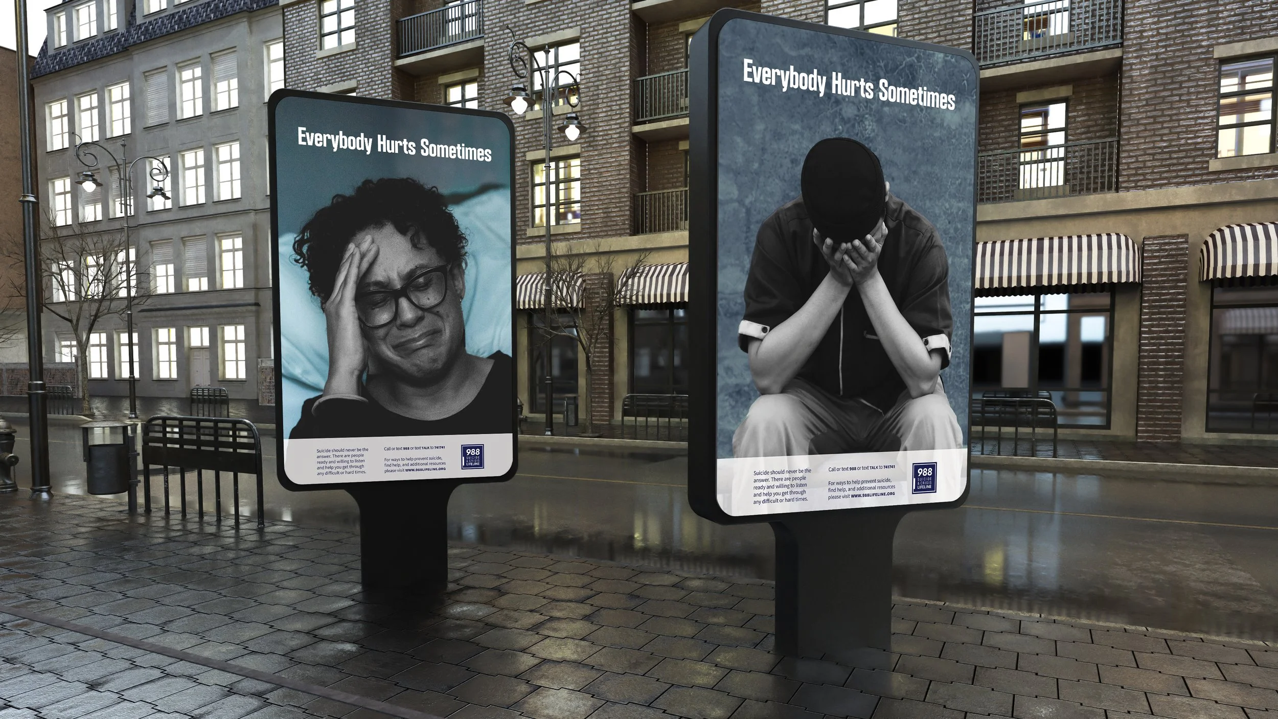
For my color I decided to use dark blue and ended up using the same color as the organization’s logo. A couple of the images that I chose for my final designs had blue backgrounds, so I felt like the text would match with that and as well.
Typography
For my heading, I wanted something bold and easy to read so that it could easily catch the viewer’s attention and make them want to read more. I chose a sans serif that I thought had a simple, straightforward look to it. For the subheadings I wanted to stick with another sans serif to create a nice companionship between the two typefaces.
First Digital Iterations
My first iterations featured the headings “Don’t Give Up” and “It’s ok to ask for help”, however I received feedback that suggested using something less cliché. My first designs were a bit too heavy on the information and the images didn’t seem to match the content. I think that the color of the first design set is too bright and could feel overwhelming to the viewer. I reduced the information and changed the heading text and color for the second iteration. However, I kept the same images, which was a problem and needed to be fixed before the final design. The design was more visually pleasing, but there was still room for adjustment.
Final Designs
For the final design, I changed all the images and changed the color of my subjects to black and white, while keeping the background blue for each poster. Having the white text on top of the blue seems to make it pop and catches your eye. I think that the heading makes a nice statement and isn’t overused like the statements in my previous iterations. I’m happy with how these posters turned out and think that they make are relatable and can make people know that they aren’t alone in their feelings and that it’s ok to get help.


