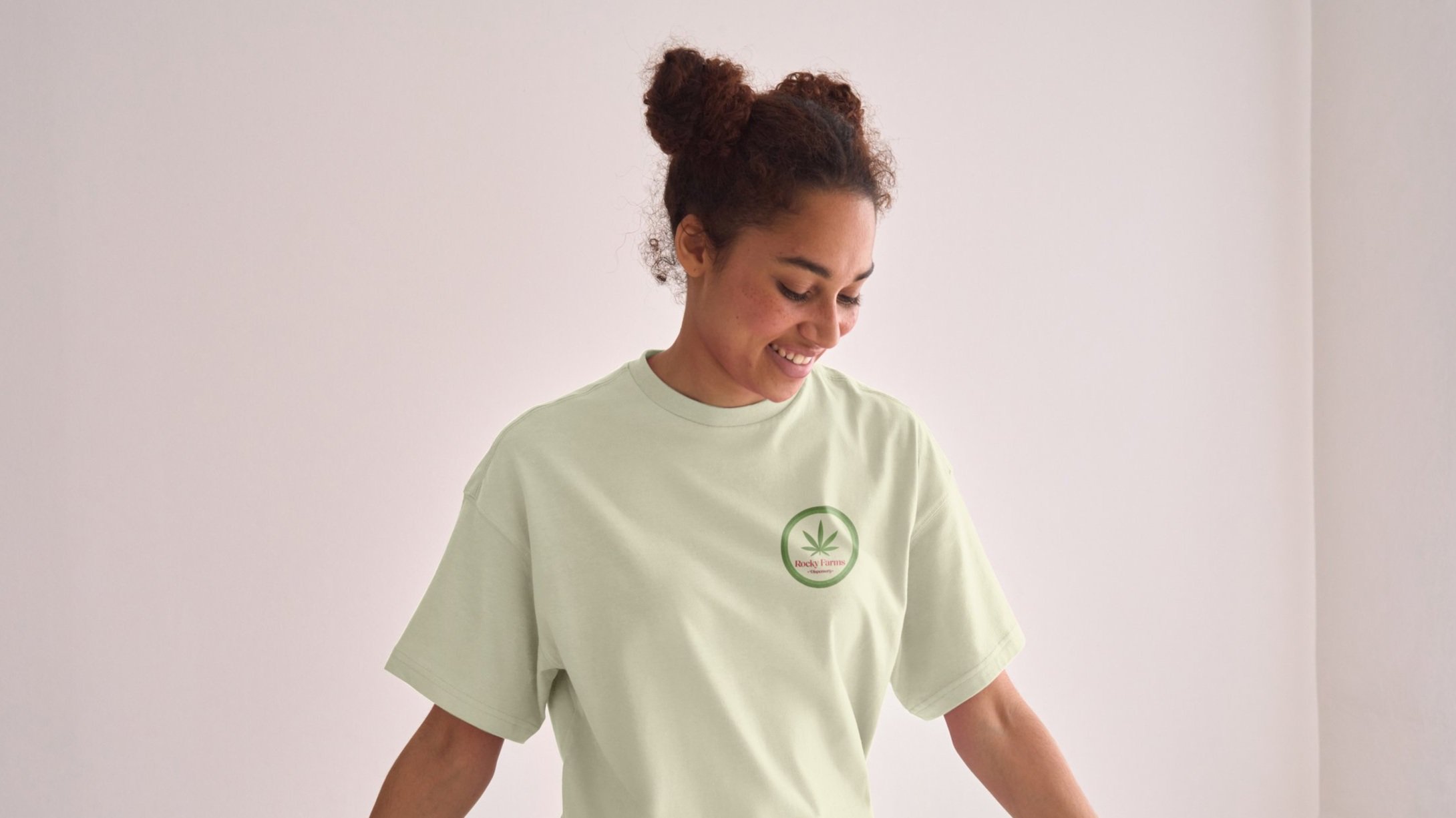
Rocky Farms Rebrand
This project involves refreshing a company's logo to establish a new look that is both visually appealing and enhances communication with customers. By updating the logo's aesthetic, the aim is to ensure it effectively connects with and engages patrons, reflecting the company's values and vision in a clear and compelling way.
Original Logo
How it started
As a rebrand, this company already had a logo and other design elements that needed to be reimagined. The company that I chose to redesign for is a local dispensary that I felt could use a new look to fit their aesthetic better. Upon researching, I found that many patrons may be confused by the name and think that this company is a farm market. I wanted to make it prominent what type of business this was, to help reduce any of that confusion, while also creating a fun and professional look overall.
Colors
For the colors, I decided to keep the theme of green and red while introducing a tan to complete the scheme. The green to represent the color of the leaves of the cannabis plant. The red incorporates the town in which the business is located and the local produce such as watermelon that it is known for.
Typography
The typeface I chose for the headings is something light and fun that I felt like fit with the theme of the company and its employees. I like the contrast of weight to the letters as well as the slight serif that is included in this design. The subheading typeface is a serif font to balance out the more traditional font used for the headings.
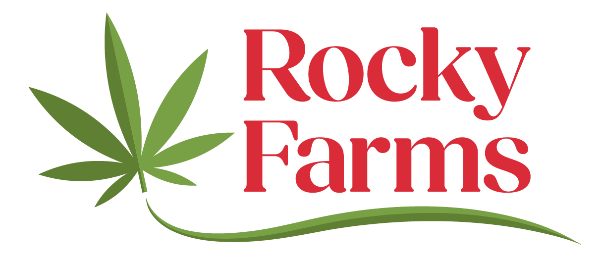
Final Logo Design
For the final design I ended up with a simple vector leaf with the business name underlined with a wave to represent the fields and farms that surround the area. I think that the design has a natural look that matches with the plant that is the main reason for the business in the first place.


